May 7, 2021
A Design Guide Journey

Keeping our standards even higher by improving our system
We are converting to a new model by taking our design game further. As you may know; we previously published an article about “Building an Interface Design System” and it served as a fundamental basis for our upcoming design structure. We were seeking out ways to top our game and find ways to make sure all our designers are on the same page and talking the same lingo when working on a project together. Eventually; our new Figma plugin was born with subtlety. 👼
We analyzed what we need
It takes a quite amount of time and effort when a new team member joins the design team to keep her/him updated and go through our design system and projects together. That’s mainly what drove us to come up with a solution making everyone happy and satisfied. It sure serves as a great guideline to make sure the new member adjusts to the work pretty quickly and find everything handed to them to ease the orientation process. We did an enormous amount of work covering all the details and rules about our typography and defining our style on Figma. The reason we’re doing this is because we’d like everyone to be aligned and keep our system safe, saving time and energy avoiding having the same conversations over and over with the designers and the development team as well. The standards we keep make it very easy for us on that note.
Additionally, this plugin with its flexible and scalable nature, we noticed that with Figma Business, it’ll be much more convenient to pass on our new updates to the team; which is another plus for us since it’ll literally act as an educational tool.
What do we offer here?
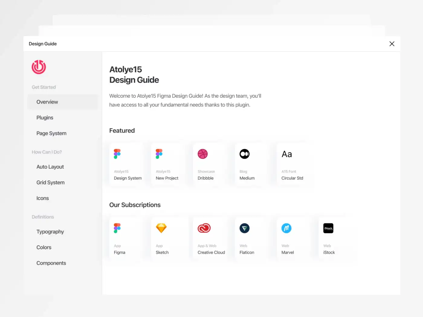
We’ve analyzed the challenges we faced as a team since we switched to Figma last year and noted crucial points we lost our control in the process. Then compiled them as a pack.
We’ve included our project draft Figma files and some highlighted content on this plugin due to the fact that we edit, improve and benefit from them each and every day. Of course we can display them on Figma as a project as well, but the valuable point here is that we keep everything clear and transparent for the newcomers.
Plugins
If you are one to spend your day with design work you surely are aware that plugins make a huge difference at times of need and it is crucial that team members know how and what we use the plugins for. That’s why we also added beneficial plugins to use on a daily routine.
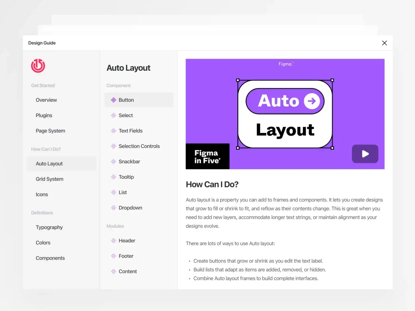
Page System
As we mentioned earlier in our “Building an Interface Design System” post, we try to build pages on Figma in accordance with Atomic design methodology under certain terms as much as we can. This time we developed a faster and convenient way to meet our needs and converted it to a model that we can use with just one click. When you interact with the buttons, the pages on Figma are automatically added.

Grid System
As a team we noticed we need to go back and forth between previous projects to review our measurements, since it is very important to follow our structural standards in every project. So we couldn’t leave it to luck. There might occur some problems checking out which designer applied which grid specification in the future. So we sit around with our development team to set up measurements in accordance with mathematical calculations and put up standards, preventing all possible problems we might face later on. 🤓
Icons
We set up strict rules on icons that we discuss a lot and noticed that we needed lots of details to catch up on. Being probably the most sensitive point of all in this system; icons led us to provide all details and list all subjects that are needed in bullets without leaving any question marks for the development team.
How to do it?
Atolye15 means taking the time off to search for things, evolve, and make an effort for R&D. We always support constant learning of our team members. Especially on these days where Figma is growing fast, we have to count in each detail and to do that we make a documentation of everything Figma related in Turkish and English. Although, we want to keep an empty space for our team mates to grow and act comfortably: we do not want them to lose their instinct and eagerness to research. Sure we generally cover everything in detail, but on the other hand we leave out a space to grow by leading team mates into making mistakes and learning from them. This is the gate of Narnia for new ideas! 😀
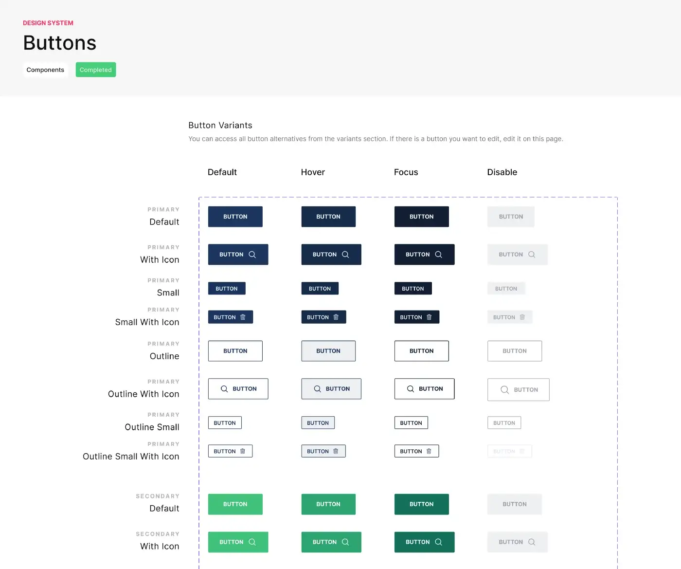
Definitions
We included components and style definitions to this plugin, which are pretty important for the projects and also our absolute favorites on the development phase! We tried to design it very basic for a great user experience. We can think of this as a “common language” step we mention in all our posts. Whenever an update is required or an extraordinary need comes up for a project, that means we’ll all get our hands dirty and work it out together to do what’s best to be done.

Definitions set for typography, colors and components are super important for our newcomer team mates. At some point we as designers want to spend more effort on adding value to our project, rather than spending time to reinvent the wheel. (What has been already standardized by us) We should also keep in mind that any project is independent from our personal perspective and at any given moment someone else can join the project. That surely proves why common language matters.
To give an example; in the case of adding a new icon for an existing component with the help of guiding documents, we have to make sure that icon is a component and has to be used in a certain way. That leads to assisting our designer friends to let them know this needs to work with the on / off (Switch) feature. With this idea in hand, we paid attention to related subjects designing the plugin.
Typography and Colors
Such as the components, we still have our set up standards when it comes to typography and colors. Fundamental rules like calculating line spaces and many others were all classified and sorted so that we won’t have any problems in the future, and documented them.

When it comes to colors, we had to make sure that no matter what kind of a project we start, we had to have a system that applies to a whole color palette, since we noticed each and every other definition style requires some extra effort from our development team. An inclusive system solved it for us and for all color systems.

This is basically it!
We thrive with willingness to top our game and each day we discover how to do that in a new way, we get pretty excited and curioso! 😊 Sure we have our boundaries and rules, cannot not live without them but if you noticed we do not have anything here to prevent us from our creativity.
Systematic and creative work is our jam and we do not want to limit ourselves either. As team Atolye15, the core of what we do is the respect we put in our work!
Thanks for sharing our excitement! We’ll pretty soon be sharing our “Atolye15 Design Guide” plugin on Figma Community platform! Stay tuned and see you on other news! 😎👋