June 9, 2021
How Do We Use UX Principles In Recruitment Interviews?

Have you ever used and known methods related to your field of expertise in business life for used it to solve problems you encounter in daily life?
Each of us is dealing with many problems during the day by doing different jobs in different fields. Our approach to all these problems, our way of solving the problem differing by industry. There are many developed methods and approaches, and we are trying to move forward by accepting them as a guide. We are aware, all this is what we are talking about sounds a lot like “business life”.
While researching content creation as the Atolye15 design team, an idea came to our minds. Couldn’t all these problems we encounter in business life and the methods we follow as a result be our way of coping with the problems we encounter in our daily life? There are many rules, methods, and content that we take as guides ourselves. Do we use them all just to make our work life easier? Can’t we use these methods in daily life as well?
In fact, one of the most enjoyable aspects of being a designer is the way we approach problems. When your job is to solve problems, you inevitably approach the problems you encounter in daily life from a professional point of view. Processes such as problem identification, problem-solving, and empathy, which we frequently use in design processes, inevitably contributing to our personal development. We really like to do this job, which is based on human psychology.
Let’s take recruiting interviews, which can be stressful for each of us as well as we develop as we experience. If you’re ready, let’s make this challenging experience easier with Jacob Nielsen’s interaction design principles!
Visibility of System Status
The first heuristic says that we should inform the user about what is going on in the system. We can explain this as the candidates explaining themselves in all transparency in a job interview and transferring their resumes clearly and descriptively to the recruiter. What is the candidate these days dealing with? What does he/she like to do outside of work? what about areas of interest? Where did he/she last work? In short, we can think of it as the part where the candidate clearly and clearly conveys what is going on with herself/himself.

Match Between System and the Real World
The heuristic basically says that the system should understand the user’s language and that the user is prone to experience the daily life experiences they are accustomed also in digital. We can liken this situation to a recruitment specialist looking for a candidate who can adapt to the company culture. In this case, we can say that it is very important for the candidate to research the company, company culture, and company expectations well before the interview and decide whether this is in line with her own expectations.
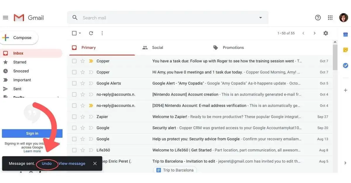
User Control and Freedom
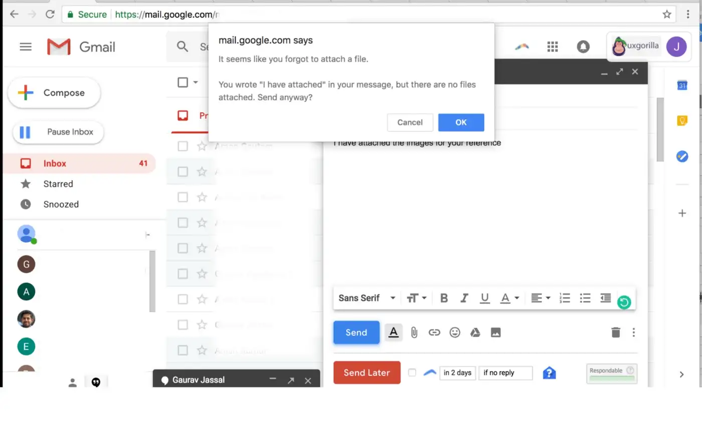
The heuristic says that the user should use the product easily and that the users should be able to easily compensate for the mistake by them. One of the best examples of this situation is that we have the option to retrieve the sent mail within a certain period of time. The user should know that he/she is in control and should be able to use the product freely, just as the candidates feel comfortable and free during the interview themselves and conveys to the recruiter comfortably and clearly.
Consistency and Standards
Consistency is perhaps one of the most important candidate considerations for a recruiter. This heuristic tells us that the product must be consistent. As Atolye15, we can say that we have made a lot of investments in this regard, especially in the last 1 year. the companies that understand the importance of the design system have already started to make serious investments.
In this case, the candidates should explain themselves to the recruiter transparently and consistently without contradicting themselves. Self-reflection without any brag or see yourself down is much more favorably received by recruiters.
Error Prevention
The heuristic telling us that we must prevent the user from making mistakes.
Although the solution suggestions give a good experience to the user, it seems like a much better method to avoid the error from the beginning. In this case, when we convey ourselves to the recruiter in the most accurate way, we prevent any bad impression that may occur about us as well.
Recognition Rather Than Recall
The heuristic emphasizing that we should minimize the cognitive load of the user. We can liken this to the fact that confusing the recruiter’s head with unnecessary details is one of the biggest mistakes that can be made.
Flexibility and Efficiency of Use
The heuristic emphasizing to us the importance of shortcuts. One of the most practical ways to use a product correctly and effectively is shortcuts. In fact, very similar to the previous principle, it would be the right choice to explain ourselves, our competencies, and expectations to the recruiter clearly and transparently without leaving the context in recruitment.
Aesthetic and Minimalist Design
The heuristic mentioning that it is necessary to present the product with a minimalist and aesthetic approach by giving the required amount of information without overwhelming the user with unnecessary information. In this context, the choice of attire in the interviews is as important as the care in our behavior. We can say that choosing a simple, stylish, and careful outfit will make a good impression.

Help Users Recognize, Diagnose and Recover from Errors
The heuristic emphasizing that a solution proposal should be brought along with the error messages presented to the user. In error messages, giving the cause of the error along with a solution suggestion or offering password suggestions to the user are the best examples of this situation. In this context, we can say that it is very important to develop a solution proposal without disappointing the user.
As we all know, recruiters try to get to know the candidate much better by asking some tricky questions. Let’s take a look at the examples below.
Example 1:
X: What are your weaknesses about yourself?
Y: I’m not good at time control.
Example 2:
X: What are your weaknesses about yourself?
Y: Recently I realized that I am not able to control my time. But as soon as I realized this, I did some reading on the subject and found a couple of very useful methods. I can say that I am making progress in this regard now.
In Example 2, we kind of say that we are aware of our weakness and we have a solution proposal for it.
Help and Documentation
It is very important to guide the user with help texts and provide to use the product without any question marks. In this context, if we consider the principle for our recruitment scenario, your resume, which the recruiter has reviewed beforehand, would be a good example of this. Our resume, which is free of unnecessary details and reflects ourselves as we are, will undoubtedly put us ahead of many candidates.

Last Words
Our aim was to share with you how we can perceive the principles of user experience as a guide in daily life by scripting them. We hope you enjoyed reading and had a great time! We, as the Atolye15 team, will continue to produce and discuss issues from different perspectives, stay tuned! Hope to meet you in another content…