After aligning on scope and product direction, we began with Kuantist’s mobile application, treating it as the primary touchpoint for everyday crypto interaction. In a sector where regulations can shift overnight and compliance requirements evolve rapidly, the product needed to be built for adaptability from day one. Rather than designing static interfaces, we focused on establishing a modular design system that could respond to structural change without breaking the experience.
We started with in-depth benchmarking of leading cryptocurrency platforms, analyzing onboarding flows, trading mechanics, portfolio dashboards, and notification systems to identify friction points that directly impact trust and conversion. These insights were translated into detailed user flows and structured user stories, aligning business logic, technical feasibility, and regulatory considerations before moving into interface design. Wireframing allowed us to validate complexity early, ensuring financial logic remained robust while the surface experience stayed intuitive.
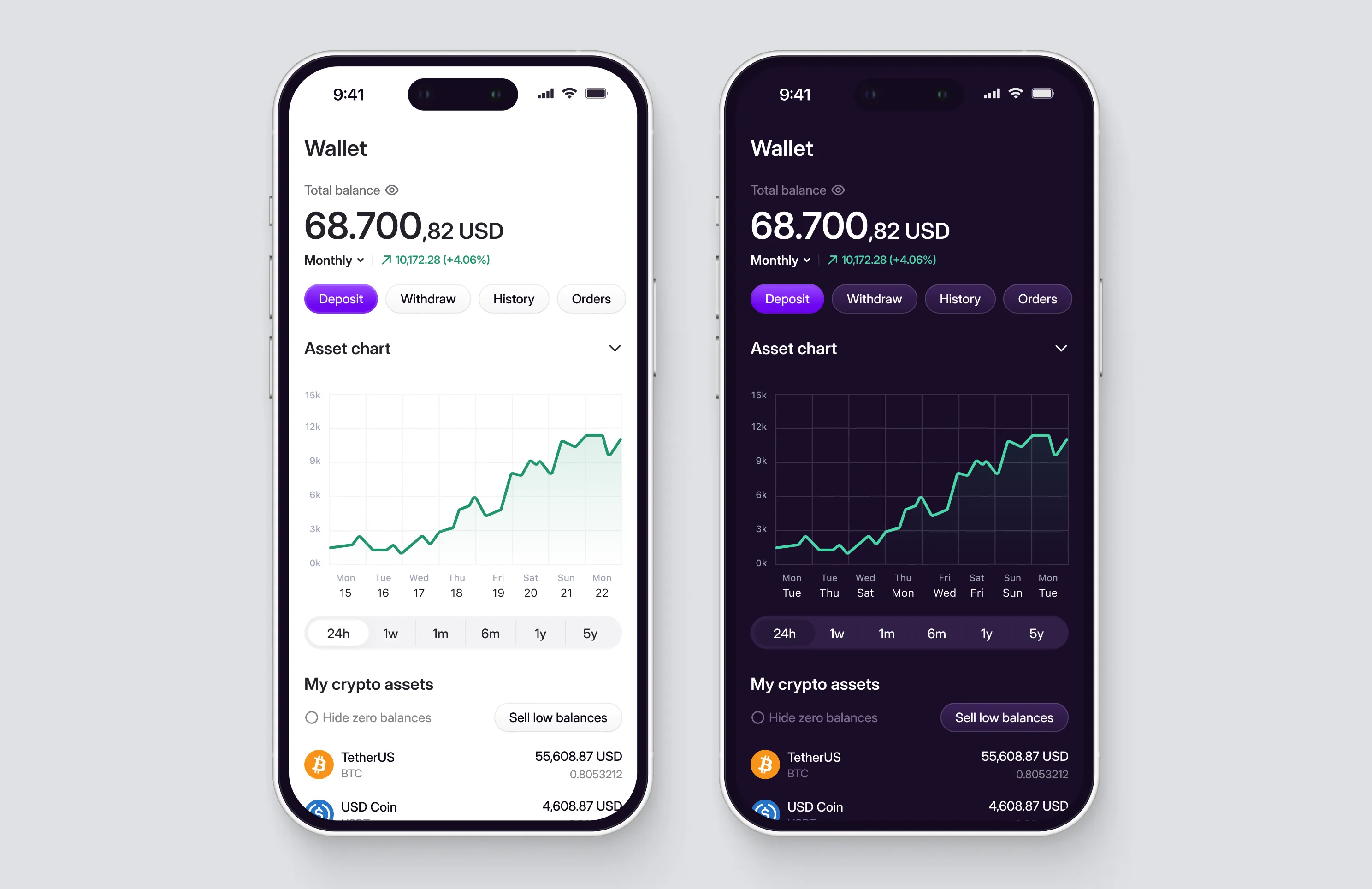
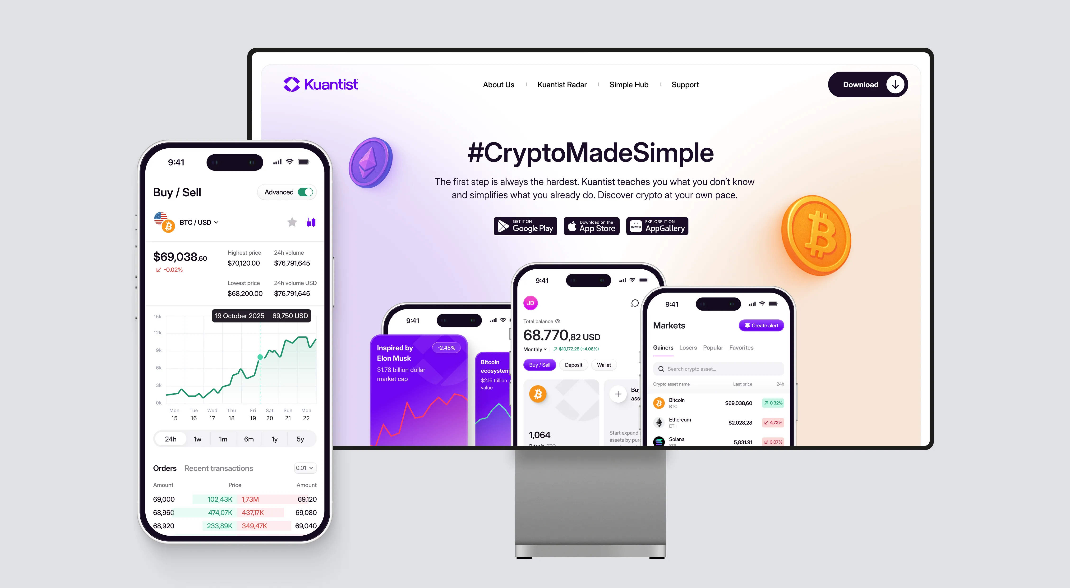
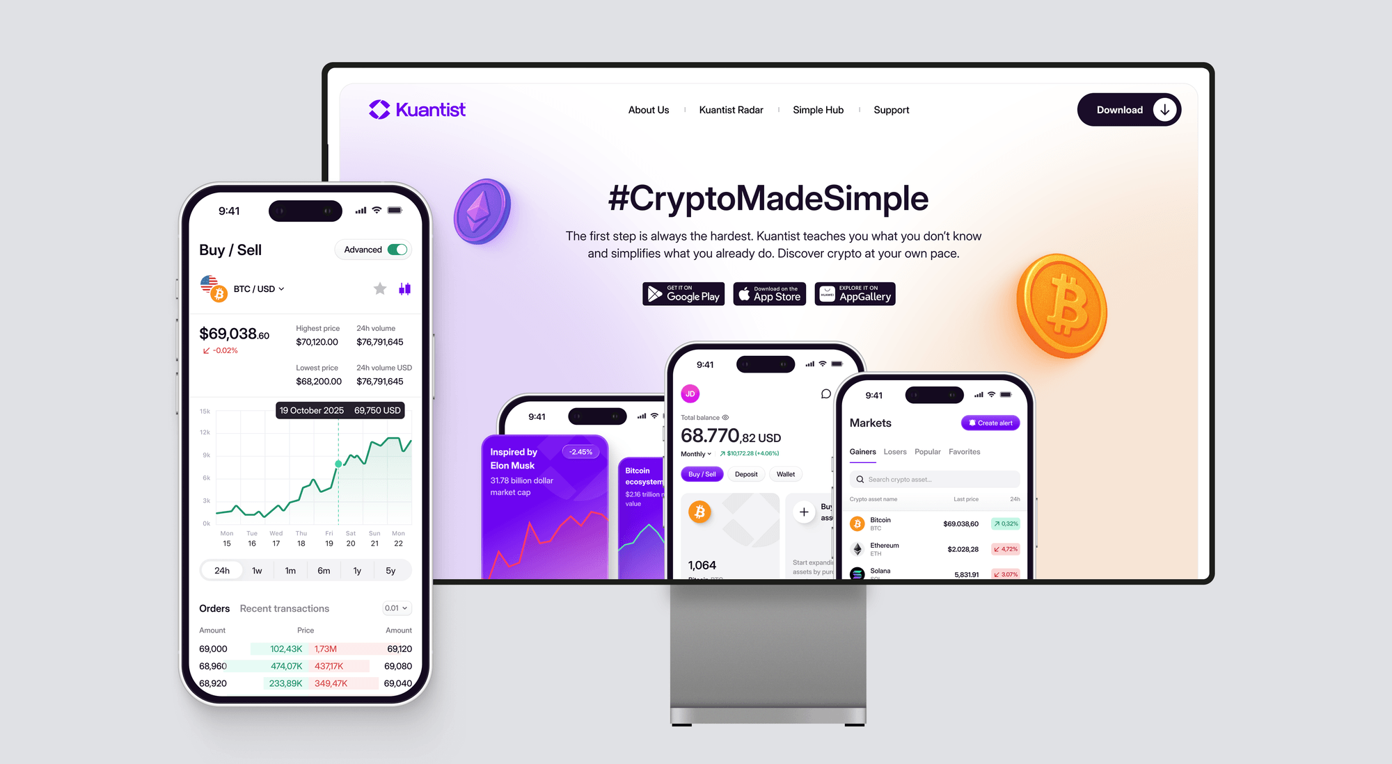
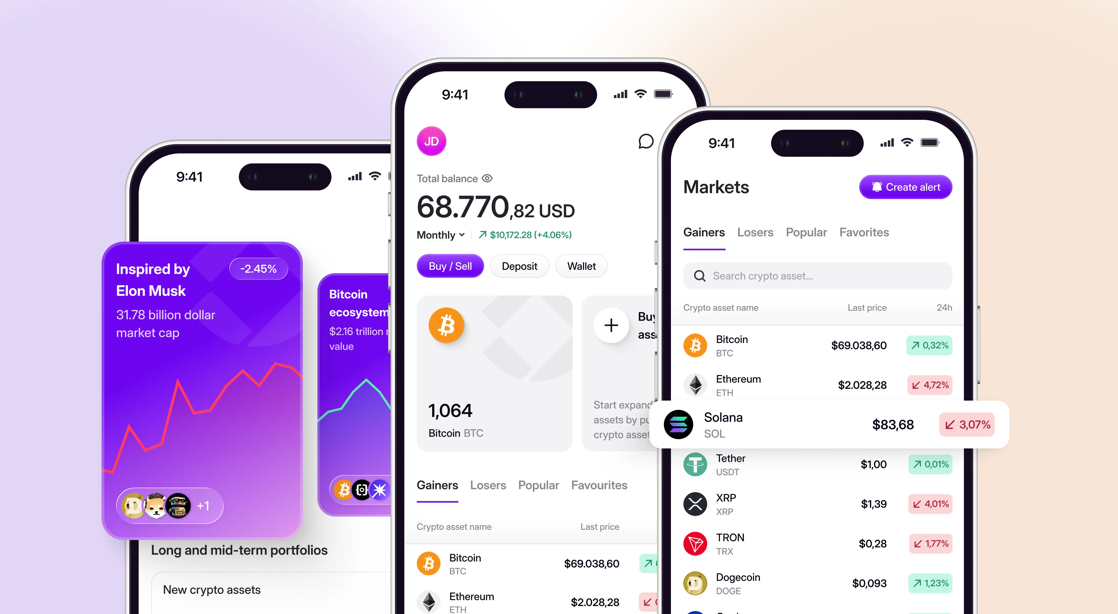
The result was a scalable mobile ecosystem of 250+ screens across iOS and Android, designed and iterated collaboratively in Figma. Trading interactions, state changes, confirmation patterns, and error handling were carefully structured to support confident decision-making in a high-stakes fintech environment. Micro-interactions were not decorative details, but system-level reinforcements of clarity and control. Custom 2D and 3D illustrations strengthened brand identity while guiding users through critical moments. For a closer look at the visual system and interface details, explore the project in our latest Dribbble post.
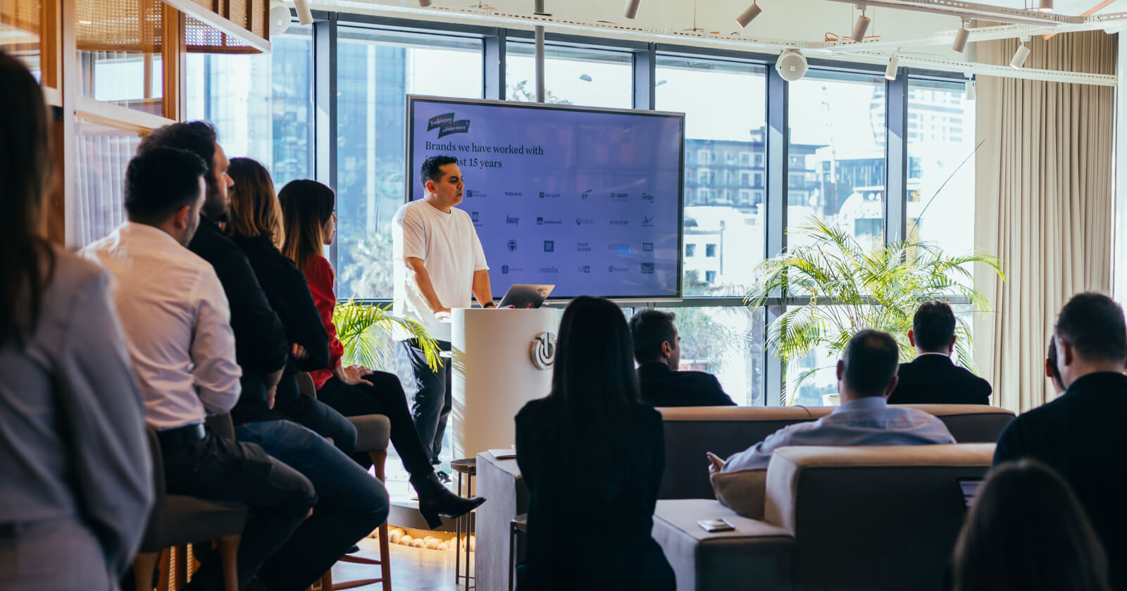
Throughout the process, we operated as an embedded extension of Kuantist’s internal team. From the first modules onward, we worked closely with them maintaining weekly demos, live feedback loops, and constant alignment sessions. This was not a handoff-based workflow. It was an integrated product collaboration where design decisions directly informed development logic and vice versa.
Once the mobile product reached a stable and scalable foundation, we extended the same system and product logic to Kuantist’s web presence, delivering 12 structured web pages built in Webflow. The landing experience balanced trust, clarity, and conversion, seamlessly directing users toward the mobile application while maintaining consistency across platforms.


.webp)